


In order to view the data for a buoy, follow these steps in order:
Once a buoy has been selected, the list of years will be updated to only allow selection of the years for which data was available from NDBC. This does not guarantee that there is sufficient data for all images to have been computed.
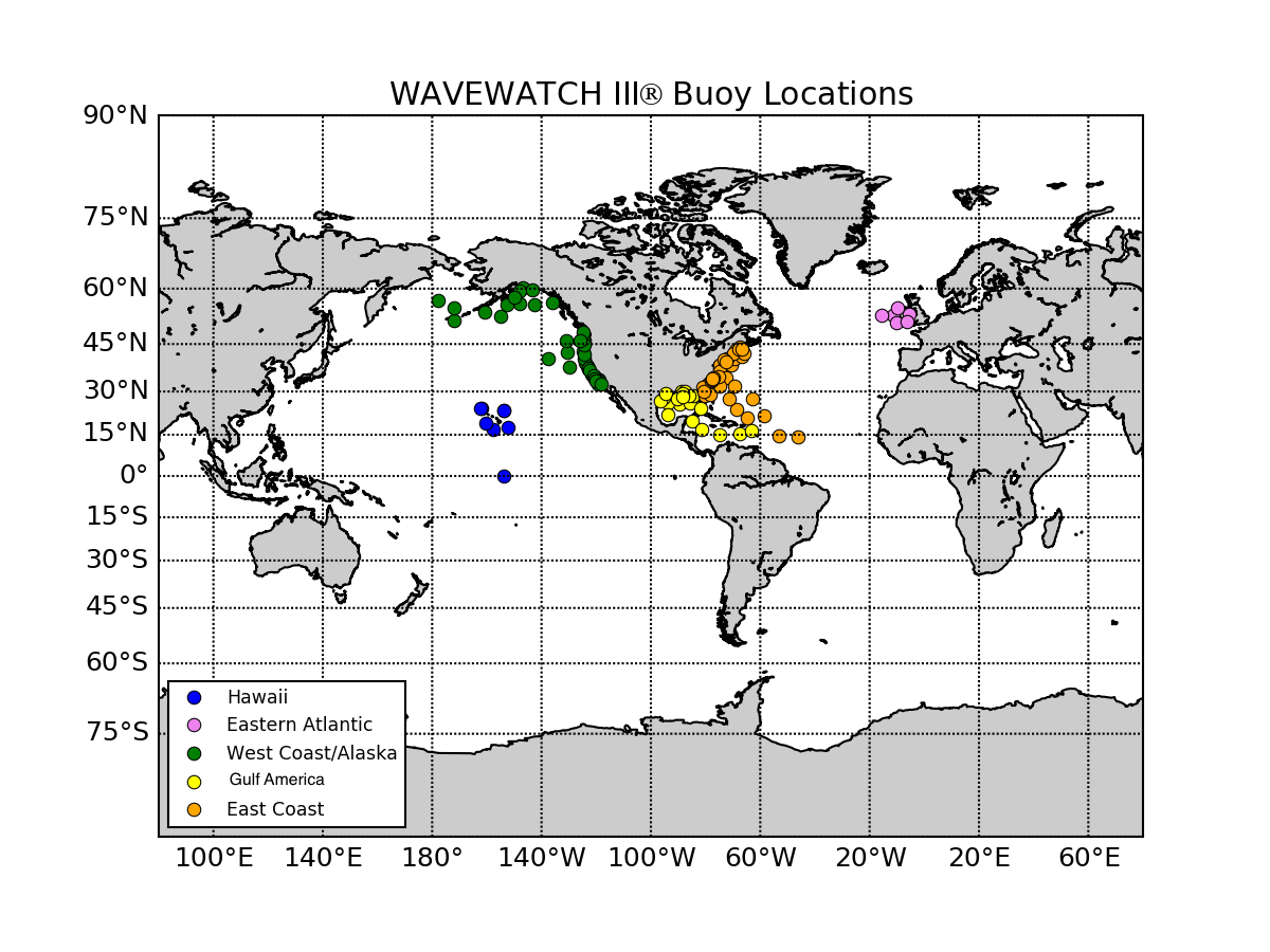
The default Wind-Wave image is a map of all of the buoy locations in the Archive. The same map can be viewed by clicking on the Buoy Locations link below the Months selector.
Note that until you select Buoy, Year, and Month, the Archive will display a "No Data Available" image. This will be replaced by the correct image once all three items are selected, except for the Aggregated tab, whch only requires a year to be selected.
Once all three are selected, you can continue changing any of the three selections as you like. The Archive will update the images as you proceed. Note that if you change buoy after the year and month have been selected, you can find your year and month selections are for missing data. Just re-select the year from the list of available years.
Protip: Use the Wind-Wave tab as your navigation aid, as it will show you if any data is available, or if there is missing data during the month. In particular, the blue lines (NDBC data) are often gappy, as they represent real-world data. If the NDBC data is missing for the entire month then there won't be any Scatter Plot or Q-Q Plot. If there is any NDBC data for the year, a Taylor Plot will be available.
However there is an idiosyncrasy on the selection process. The Scatter Plot may sometimes not update even if all three selections have been made. To reset it, just click to another month and then back to the month in question. This will trigger a refresh in the page and the Scatter Plot (if available) will display.
The model is driven by hourly 1/2 degree CFSR Reanalysis wind fields that have been corrected to remove bias in the 99th percentile wind speeds. Wind speeds are given in meters/second (m/s) and direction in degrees.
NDBC buoy wind speeds are recorded at the buoy anemometer height and are not height adjusted by NDBC in the archive. We estimate the winds at 10 meters by using as method described by S. A. Hsu et al. (1994).
Although never used operationally by NDBC, the method was tested and found to compare favorably with the more elaborate method under near-neutral stability. This is the condition most frequently encountered at sea and occurs when air and water temperatures are not too far apart. The method, referred to as the Power Law Method, is offered here for those who may want to explore the nature of the marine wind speed profile without having to deal with the complexity of the above method. The relationship is:
u2 = u1 (z2/z1)^Pwhere u2 is the wind speed at the desired reference height, z2, and u1 is the wind speed measured at height z1. A value for the exponent, P, equal to 0.11 was empirically determined to be applicable most of the time over the ocean.
Reference
Hsu, S. A., Eric A. Meindl, and David B. Gilhousen, 1994:
Determining the Power-Law Wind-Profile Exponent under Near-Neutral
Stability Conditions at Sea,
Applied Meteorology, Vol. 33, No. 6,
June 1994.
The significant wave height is defined as the mean wave height (trough to crest) of the highest third of the waves. Note that the highest wave height of an individual wave will be significantly larger. Significant wave height values are in meters (m).
The peak wave period is estimated as the period corresponding to the highest peak in the one dimensional frequency spectrum of the wave field. The wave field generally consists of a set of individual wave fields. The peak period identifies either the locally generated "wind sea" (in cases with strong local winds) or the dominant wave system ("swell") that is generated elsewhere. Peak wave period values are in seconds (s).
The mean difference between the model and observations, measures the tendency of the model process to over- or under-estimate the value of a parameter. Smaller absolute bias values indicate better agreement between measured and calculated values. Positive bias means overprediction, negative means underprediction.
diff = model_data - buoy_data
bias = diff.mean()
Also called the root-mean-squared deviation, it's a measure of the differences between the observed and predicted values. Smaller RMSE values indicate better agreement between measured and calculated values.
rmse=(diff**2).mean()**0.5
Defined as the standard deviation of the difference between model and observations, normalised by the mean of the observations. Smaller values of SI indicate better agreement between the model and observations. Note that low wave heights or areas where wind seas dominate can result in high SI values.
scatter_index=100.0*(((diff**2).mean())**0.5 - bias**2)/buoy_data.mean()
Shows the relationship of a specific parameter (u10, udir, Hs, Tp) by plotting the buoy value on the x-axis and the model value on the y-axis. The ideal agreement would line up all the points along the 45 degree dashed line. The solid blue line represents the Ordinary Least Squares (OLS) fit to the data. Additionally, the Adjusted R-Squared value is given: this is a statistical measure of how well the regression line approximates the real data points, adjusted based on the number of observations and the degrees-of-freedom of the residuals.
A Q-Q plot is a plot of the quantiles of the first data set against the quantiles of the second data set. This is a graphical technique for comparing two probability distributions - if the two distributions agree, then the Q-Q plot follows some line. Perfect agreement would yield the y=x line. If the general trend of th Q-Q plot is flatter than the line y=x, the distribution plotted on the x-axis is more dispersed than the distribution plotted on the y-axis, and vice versa.
Taylor diagrams are usually used to show how a variety of different models do compared to the same data source. However, we want to show how one model does at a variety of data sources (different buoys). In order to put the data from many different buoys on the same Taylor diagram, first you have to normalize the model and observation values by the standard deviation of the observation. In this case the model buoys standard deviation is divided by the observed buoys standard deviation. But you must also normalize the observed values standard deviation: this means that the observations standard deviation will be set to 1, cross-correlation is 1, and the RMS is 0. So you've basically replaced all the observed points by the star at 1 along the x-axis of the Taylor diagram, and you just plot all of the model buoys statistics.
The Aggregated tab contains time series for Significant Height (Hs) and Wind Speed (u10) gathered across all reporting buoys and analyzed per-day for the full year. If you select a Year the aggregated statistics for all reporting buoys for the full year are shown. If you then select a Month then the aggregated statistics for that month within the selected Year are shown. Reselecting a Buoy or Year will reset back to the full-year aggregation.
)