Graphical Diagnostic Tools
Part III
Hyun-Sook Kim
IMSG at NCEP/EMC
Hurricane Project Team
Part III
Hyun-Sook Kim
IMSG at NCEP/EMC
Hurricane Project Team
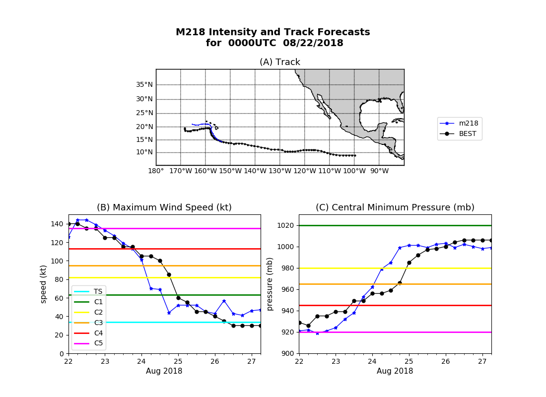
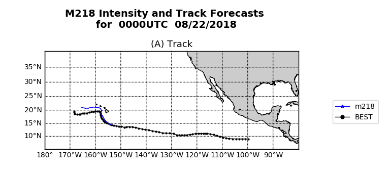
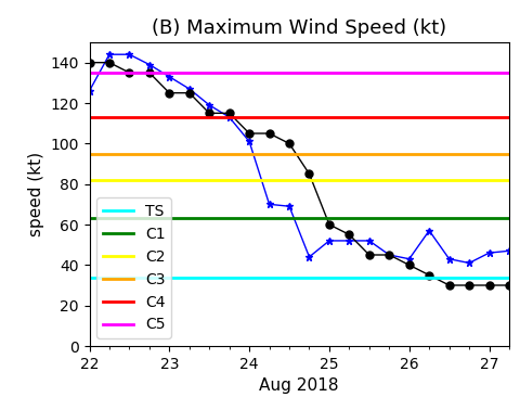
plotting storm track and intensity on one figure
Example: Hurricane Lane (14E) for 00Z 2018/08/22 cycle
Example: Hurricane Lane (14E) for 00Z 2018/08/22 cycle
how to run python with input arguments
python atcf2BT.py hmon M218 14e lane 2018082200
list of input arguments
#================================================================
if __name__ == "__main__":

model = sys.argv[1]      # 'hmon' <= model system name
expt0 = sys.argv[2]      # 'M218' <= system version
tcid  = sys.argv[3]      # '14e'  <= TC ID
storm = sys.argv[4]      # 'lane' <= TC name
YMDH  = sys.argv[5]      # '2018082200' <= TC cycle
set the figure size
    # date time for cycle
Cycledate = datetime.strptime(YMDH,'%Y%m%d%H')
ymdh4title = Cycledate.strftime('%H')+'00UTC  '+ Cycledate.strftime('%m/%d/%Y')

    # figure size in inches
fig =  plt.figure(figsize=(11,8))

    # figure title
plt.suptitle(expt0.upper()+' Intensity and Track Forecasts \n for IC='+ymdh4title,y=0.91,fontsize=14,weight='bold')
the top panel
#-- FIGURE for Track
ax1 = plt.subplot2grid((2,5),(0,1),colspan=3)            # subplot position
plt.plot(blon,blat,'-ok',linewidth=1, markersize=2)       # Best Track
plt.plot(aln1,alt1,'-*b',linewidth=1, markersize=3)       # Predicted
plt.contour(ctx,cty,z0m,[0],colors='k')                   # coastline: ctx,cty are output from my user function
plt.axis([180,220,5,30])                                  # set x and y limits
plt.grid()                                                # grid on
plt.title('(A) Track',fontsize=13)                        # title on current axis
the bottom left panel
#-- FIGURE for Vmax
ax2 = plt.subplot2grid((2,2),(1,0))
plot_Saffir_Simpson_WPscale('vmax')                    # call user function with an input arg.
plt.plot(adt1,avmx1,'-*',color='b',linewidth=1,markersize=6)
plt.plot(bdt,vmax,'-o',color='k',linewidth=1, markersize=5)
plt.xlim([min(adt1),max(adt1)])                                  # set x limits
plt.ylim([0., 150])                                              # set y limits
plt.legend()                                        # legend for the plot function
plt.title('(B) Maximum Wind Speed (kt)')                         # plot title
plt.ylabel('speed (kt)')                                         # y-axis label
embedded plotting function
def plot_Saffir_Simpson_WPscale(arg1):
   """ arg1 = vmax or pmin
   """
   # Saffir-Simpson: [knot, hPa, 'color']
   out=Colors_SaffirSimpson()                # a user defined function residing outside the script:
                                             # from utils4HWRF import Colors_SaffirSimpson

def Colors_SaffirSimpson():
# --------------------------------------------------
#     returns (knot,hPa, color)
# --------------------------------------------------
return{
        'ts': [34, 1020, 'cyan'],
        'c1': [63, 1020, 'green'],
        'c2': [82,  980, 'yellow'],
        'c3': [95,  965, 'orange'],
        'c4': [113, 945, 'red'],
        'c5': [135, 920, 'magenta']}
...
plot_Saffir_Simpson_WPscale('vmax') ...
plt.figure(plt.gcf().number)
   if ( arg1[0].lower()=='v' ):
     plt.axhline(out.get("ts")[0],color=out.get("ts")[-1],linewidth=2,label='TS')
     plt.axhline(out.get("c1")[0],color=out.get("c1")[-1],linewidth=2,label='C1')
     plt.axhline(out.get("c2")[0],color=out.get("c2")[-1],linewidth=2,label='C2')
     plt.axhline(out.get("c3")[0],color=out.get("c3")[-1],linewidth=2,label='C3')
     plt.axhline(out.get("c4")[0],color=out.get("c4")[-1],linewidth=2,label='C4')
     plt.axhline(out.get("c5")[0],color=out.get("c5")[-1],linewidth=2,label='C5')
...
plot_Saffir_Simpson_WPscale('pmin') ...
 if ( arg1[0].lower()=='p' ):
     plt.axhline(out.get("c1")[1],color=out.get("c1")[-1],linewidth=2)
     plt.axhline(out.get("c2")[1],color=out.get("c2")[-1],linewidth=2)
     plt.axhline(out.get("c3")[1],color=out.get("c3")[-1],linewidth=2)
     plt.axhline(out.get("c4")[1],color=out.get("c4")[-1],linewidth=2)
x-axis ticks and labels
loc = HourLocator(np.arange(0,25,6))                      # minor ticks at 6 hourly
dateFmt = DateFormatter('%d')                             # major ticks at each day

plt.gca().xaxis.set_major_locator( DayLocator())          # major tick
plt.gca().xaxis.set_minor_locator( loc )                  # minor tick
plt.gca().xaxis.set_major_formatter( dateFmt )            # date format for the major
plt.xlabel(Cycledate.strftime('%b %Y'),fontsize=13)       # x-axis label in date string
the bottom right panel
#-- FIGURE for Pmin
ax3 = plt.subplot2grid((2,2),(1,1))
plot_Saffir_Simpson_WPscale('pmin')
plt.plot(adt1,apmn1,'-*',color='b',linewidth=1,markersize=6,label=expt0)
plt.plot(bdt,pmin,'-o',color='k',linewidth=1,markersize=5,label='BEST')
plt.axis([min(adt1),max(adt1),900.,1030.])
plt.ylabel('pressure (mb)')
plt.title('(C) Central Minimum Pressure (mb)')
plt.gca().xaxis.set_major_locator( DayLocator())
plt.gca().xaxis.set_minor_locator( loc )
plt.gca().xaxis.set_major_formatter( dateFmt )

plt.xlabel(Cycledate.strftime('%b %Y'),fontsize=13)
anchor a legend non-default location
plt.legend(bbox_to_anchor=(0.90,1.70),loc='upper right',borderaxespad=0,fontsize=15)
save to a hard copy
# --- making a hard copy
pngFile=os.path.join(graphdir,expt0+'_TRACKnINTENSITY_'+YMDH+'.png')
plt.savefig(pngFile,bbox_inches='tight',pad_inches=0)
to display figure
plt.show()
Thank you